


Project Scope:
The Brand + Website Boogie
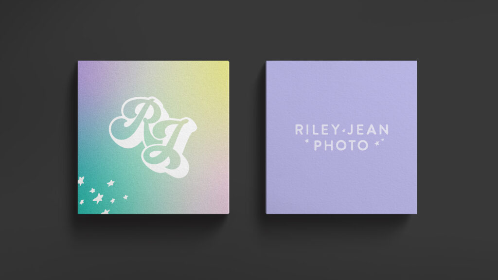
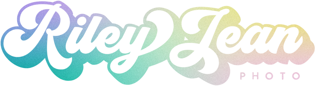
Logo Suite
Sub-Brand Development
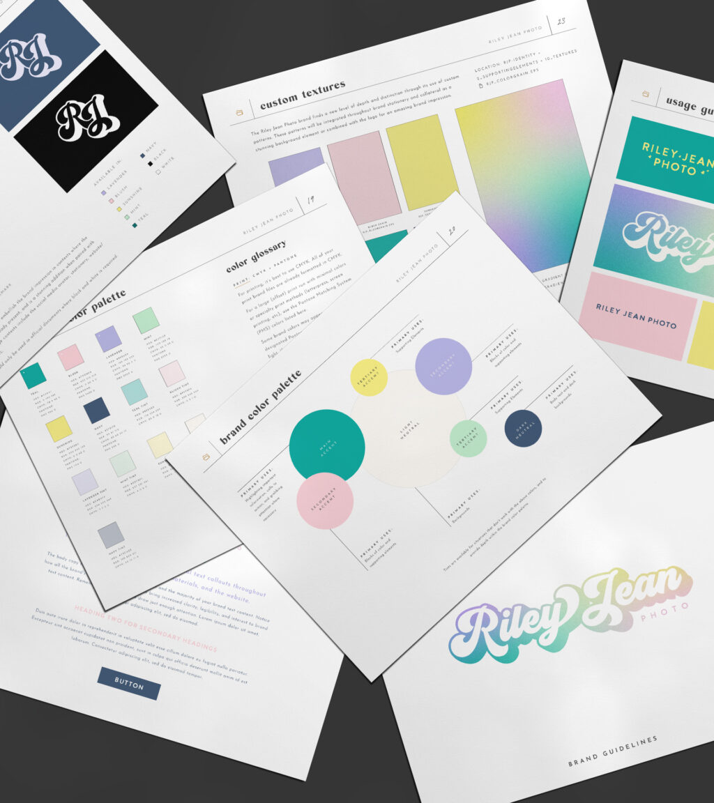
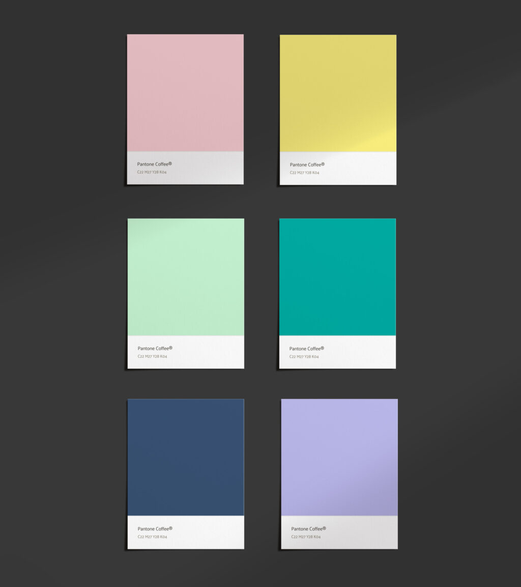
Color Palette
Font Selections
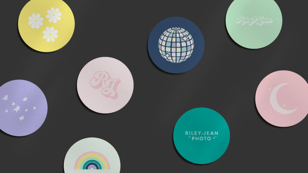
Illustration Suite
Supporting Elements
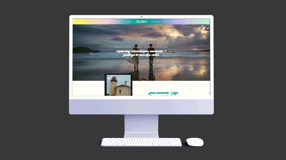
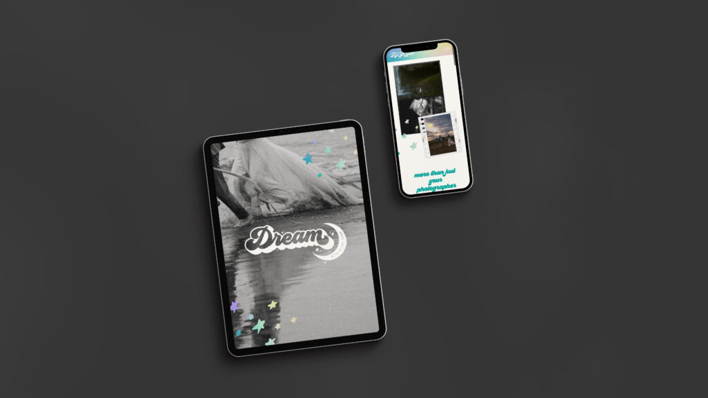
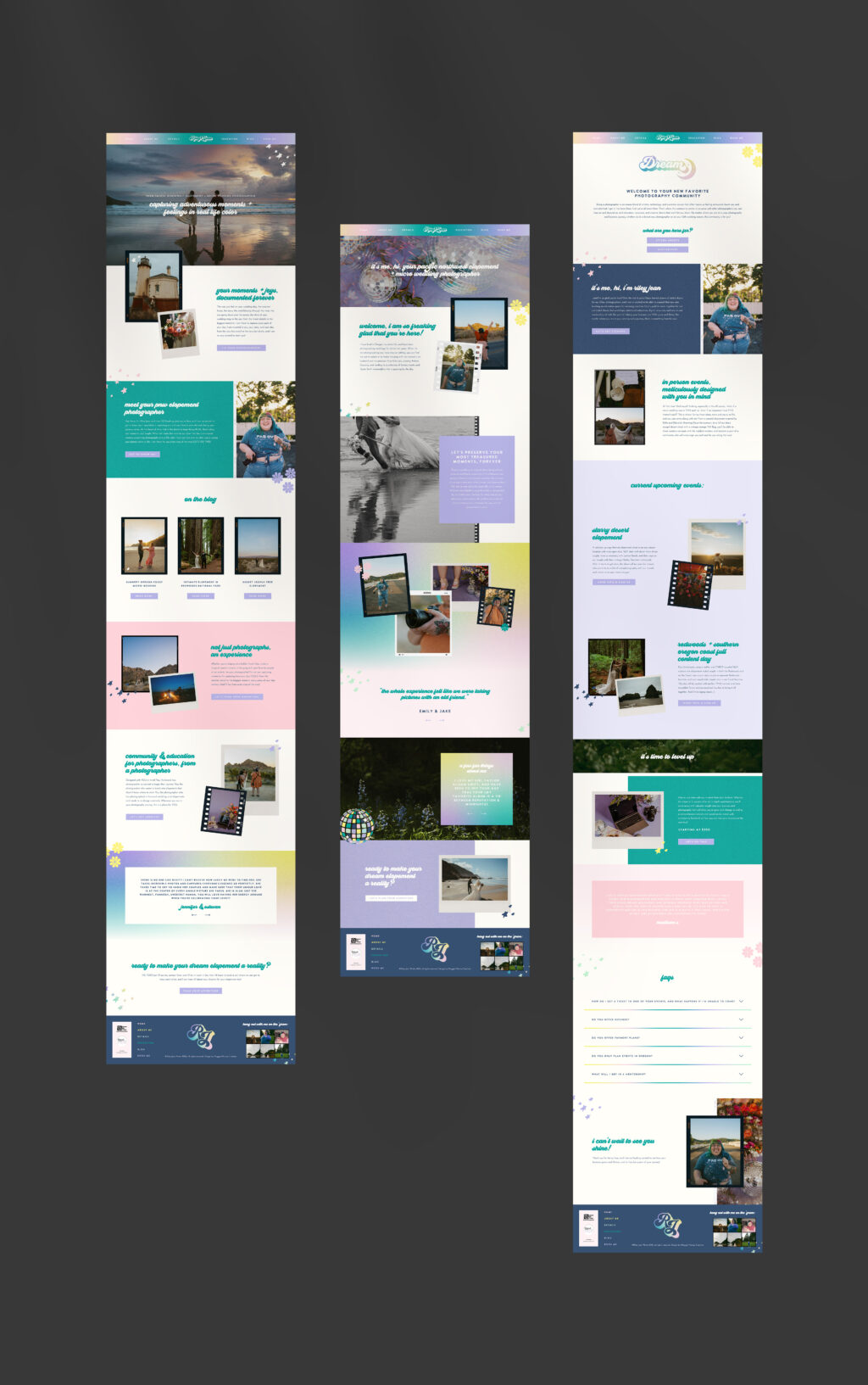
Website Design
Behind the brand:
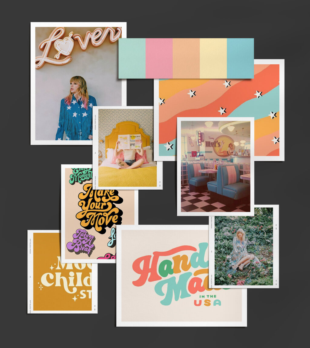
Riley’s whimsical, dream-like brand had heavy influence from retro aesthetics, Taylor Swift’s Lover album, and film photography. Pastel colors, grainy gradients that appear to sparkle, hand-drawn elements, and retro type combine to create an experience full of love & joy. Riley, who has since become a good friend (and who I attended the eras tour with), is the epitome of joyful, and creating something that reflects how bright of a human she is was such an honor.